 Sarah Lynne Reul
combat!
Posted on May 2, 2012
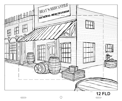
This assignment was a lot of fun to work on! It was a three-week process for my Drawing for Imagination class, and my instructor provided lots of great feedback along the way. Here’s the finished piece – I am really happy with the characters, their costumes and the general layout.

The first week, we had to design nude characters in combat – this way there’s no guesswork on the arms and legs – no clothing to hide mistakes! I added underpants so that it’s more PG and chose to go with a mismatched Laurel & Hardy-type pair: a short,squat guy fighting a tall, skinny opponent.

The second week, we had to add clothes with significant patterns – although this was intimidating at first, I ultimately really enjoyed it – I felt that the patterns added a great sense of three-dimensionality. It was satisfying to draw the curved forms – like carving into space!

The last week was dedicated to the background – I spent a while on the windows, door & the standpipe, but ran out of time for the building texture. If I had extra time, I’d fix the facing on the building so that it looks more like brick, I’d fix the window sash near the door and I’d thicken the attachment of that water drain on the front curb so that it looks sturdier. I had high hopes to add a lamp post and some shadows but it didn’t happen. Better luck next time!
layout building – "big city" theme
Posted on April 27, 2012

If I had the time to work on this some more, I would make the sky part a solid block with a light gradient, rather than cutting out the building shapes – I had some issues filling the building layer with color on the first pass, so there were patches of sky showing through the windows. I’d also darken those receding building faces to contrast more with the pigeons & the laundry. Overall though, I like this little world.
We started the assignment by making a large number of loose thumbnails and then refining down to five clearer sketches. Can you find the sketches that eventually turned into the final piece?


demo reel 2012
Posted on April 18, 2012
Have you heard about TED-Ed? The non-profit group TED.com has been providing access to “Ideas Worth Spreading” for years by hosting conferences & posting talks by remarkable people in technology, entertainment & design. Last month, they launched a new initiative to pair great educators with animators to create short lessons about lots of fascinating topics. They have a handful posted up already on the TED-Ed youtube channel.
I love the TED talks and as you may know, I’ve taught fun, informal science workshops for a few years through the Overnight Program at the Museum of Science. Although I’m pretty new to animation, I feel that the new TED-Ed project fits perfectly with what I’d ultimately like to do – help communicate great ideas through animation.
So I tossed my name in the hat! I put together a brief demo reel and nominated myself as a potential animator for future lessons.
It seems like multiple nominations are ok on their site so feel free to drop a note in for me if you’d like!
western layouts
Posted on April 10, 2012
Since my Traditional Animation 2 & Drawing from the Imagination classes have been so intense this semester, I haven’t posted much from my Layout for Animation course.
Here’s an assignment from a few modules back – the goal was to portray the same Western town from two different perspectives.
Here’s the one-point view:

And here’s the two-point view, a bit further down the street:
I think these came out ok, they’re not quite as exciting as I’d hoped. I tried to design them with lots of empty space so that characters could move around… I think if there were also a bunch of horses moving around in the foreground that might add more interest.
three heads in perspective
Posted on April 7, 2012
Here’s a recent assignment with the photo ref included. It required that we draw Ron from a 2-pt perspective (from a side angle, level with his head), Sophie from a 2-pt vertical perspective (basically, looking down or looking up at her) & Francis in 3-pt perspective (either looking down or up at him, from a side angle).

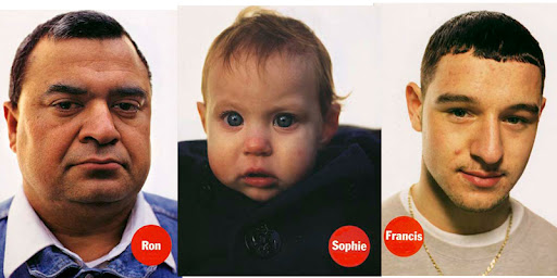
I’m pretty happy with the results. I think I got a little too excited over the guys ears… they could maybe use some toning down. I could have caught a better likeness of Sophie but I am happy that at least she doesn’t look creepy – way too often babies look freaky when they’re drawn since the proportions are so easy to get wrong.
street perspective update
Posted on April 3, 2012
Remember that one-point perspective street that took me a million hours earlier in the semester?
Well, I spent a little more time on it recently… my instructor is great at giving detailed constructive criticism, so I was happy to make the adjustments.
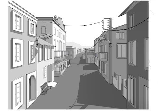
I added in those electric wires (and their shadows) that I’d forgotten before. I fixed the shadows on the front left window frames (had left out the shadows underneath the frames!) and also added one for the the left lampost & fixed the one behind the bench. I added a slight gradient to the road so that it fades off in the distance. I’m pretty happy with the way this turned out … I think it may even be submitted for the spring show! Fingers crossed.
samson & matilda – heavy lifting animation
Posted on March 29, 2012
Meet Samson and his dog, Matilda!
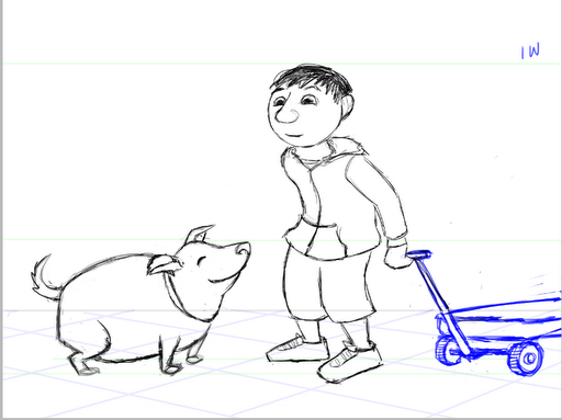
I designed them for a three-week assignment for a “heavy lifting” exercise. The focus was first on the thinking that takes place before lifting something heavy; then on portraying weight, then losing a grip on the heavy object. I could have just used a static object instead of a dog, but I really like the idea of a fat little dog (scroll down on that link for my favorite Pompeii dog).
This assignment was similar to last semester’s “stagger” exercise, where I animated a fishwife trying to lift a huge, heavy fish.
Since I was focusing on the broad action of the rough animation, I didn’t have a chance to add facial features…hopefully I’ll get to that someday!
3-point perspective (and 2-point vertical)
Posted on March 12, 2012
Here’s another Drawing from the Imagination assignment – three-point perspective (+ two-point vertical).
You can tell when something’s in three-point perspective when there are barely any truly vertical lines – all of them slant off to some point in the distance (in this case, out side of the picture to the bottom, right & left). The two-point vertical comes into play if you want to create an object that has a plane parallel to the picture plane (see the box on the shelf – the edges facing us are perfectly horizontal).
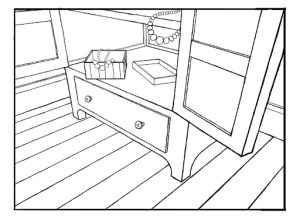
I didn’t use as much photo reference for this, and the thumbnails got buried in my photoshop layers so there’s nothing appealing to post from them, but it was a fun assignment once I figured out the point of view and composition that I ultimately wanted.
sneaky goose walk
Posted on March 10, 2012
two-point perspective interior
Posted on March 6, 2012


I'm an illustrator and 2D animator who likes lots of stuff, including science, bright colors and figuring out how things work.
